Kristian Gravelle: brand strategy, visual identity, brand guidelines, website design
Overview
Kristian is a senior marketing executive with 25+ years of leadership experience across pharma, CPG, tobacco and professional services, including roles at AstraZeneca, Kraft Foods and Cadbury Adams. A chemist turned marketer, he combines analytical rigour with a deep belief in people, and was named one of CXO Magazine's Most Influential CMOs in Canada in 2026.
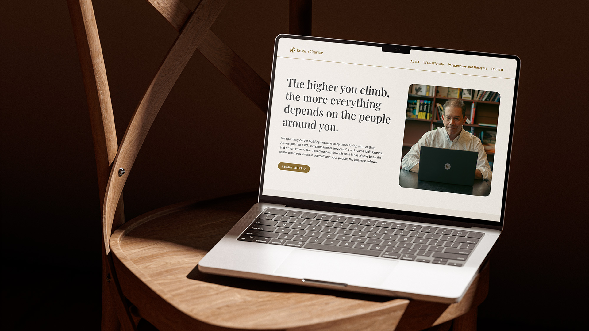
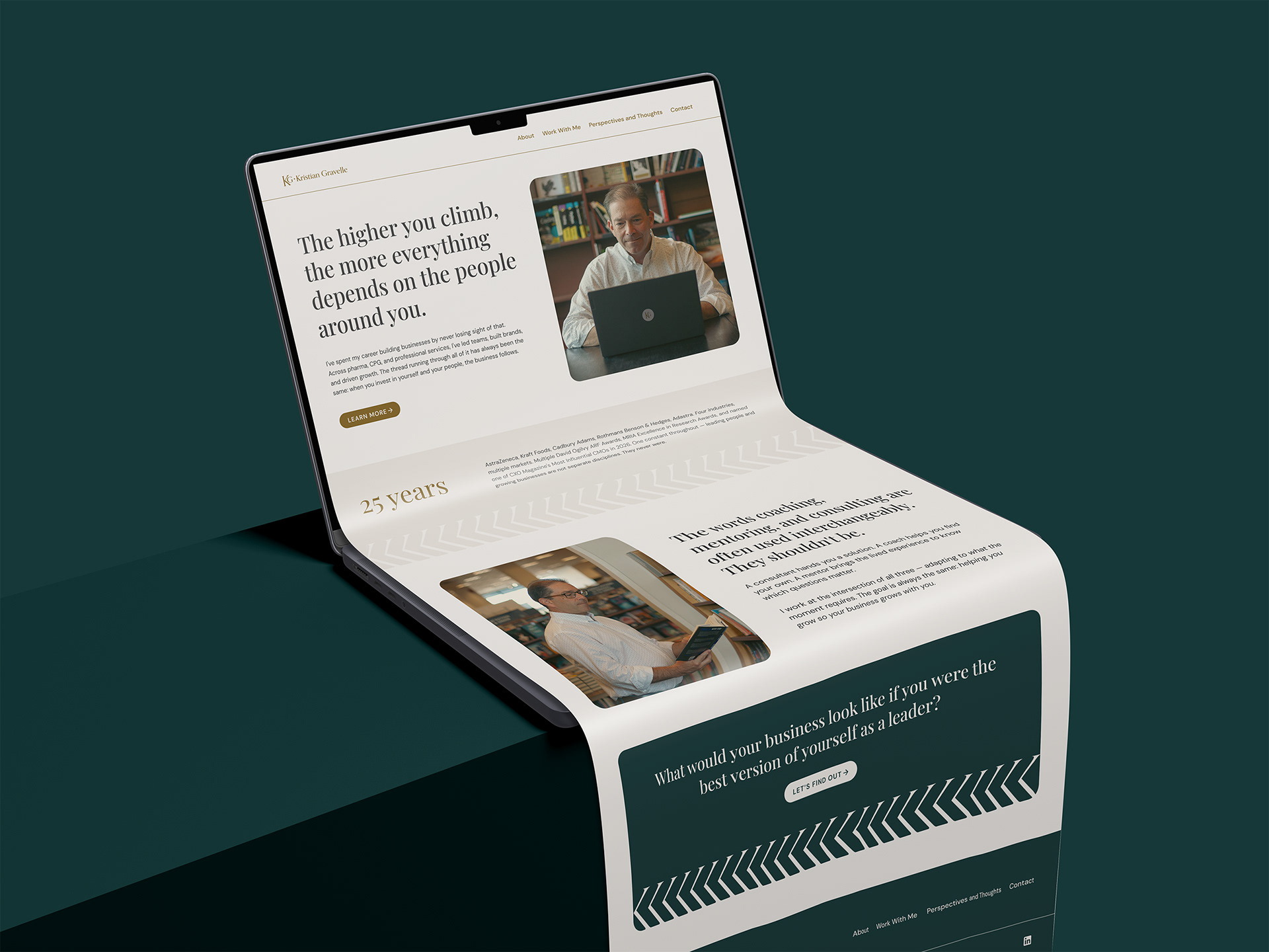
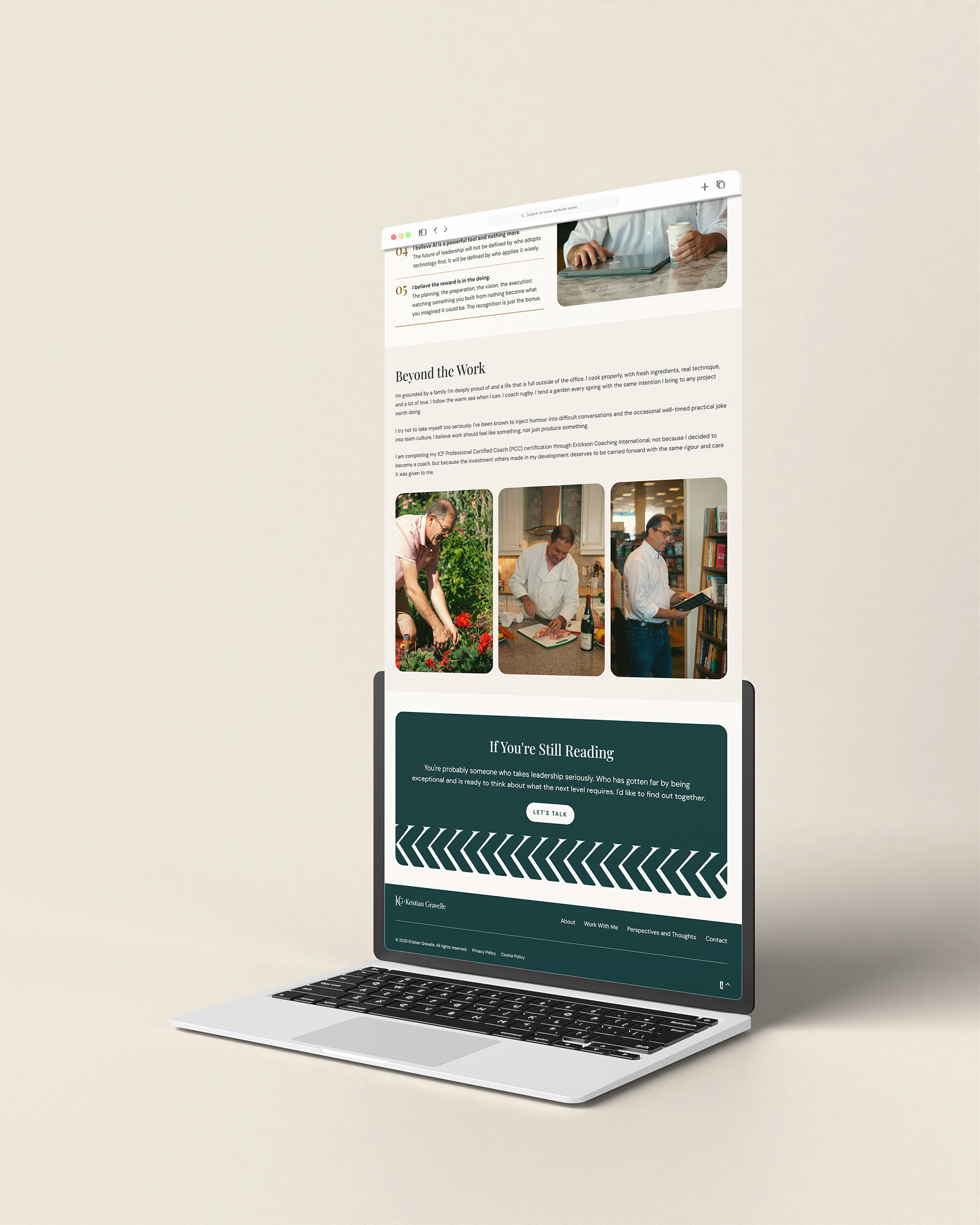
He came to me with no visual identity, but a clear brief. He was launching his new venture as an Executive Mentor & Fractional CMO and wanted a personal brand platform that feels like meeting him, not reading his pitch deck. The brand needed to speak to CEOs, CHROs and board members, and build the kind of trust that makes a first conversation feel like a natural next step.
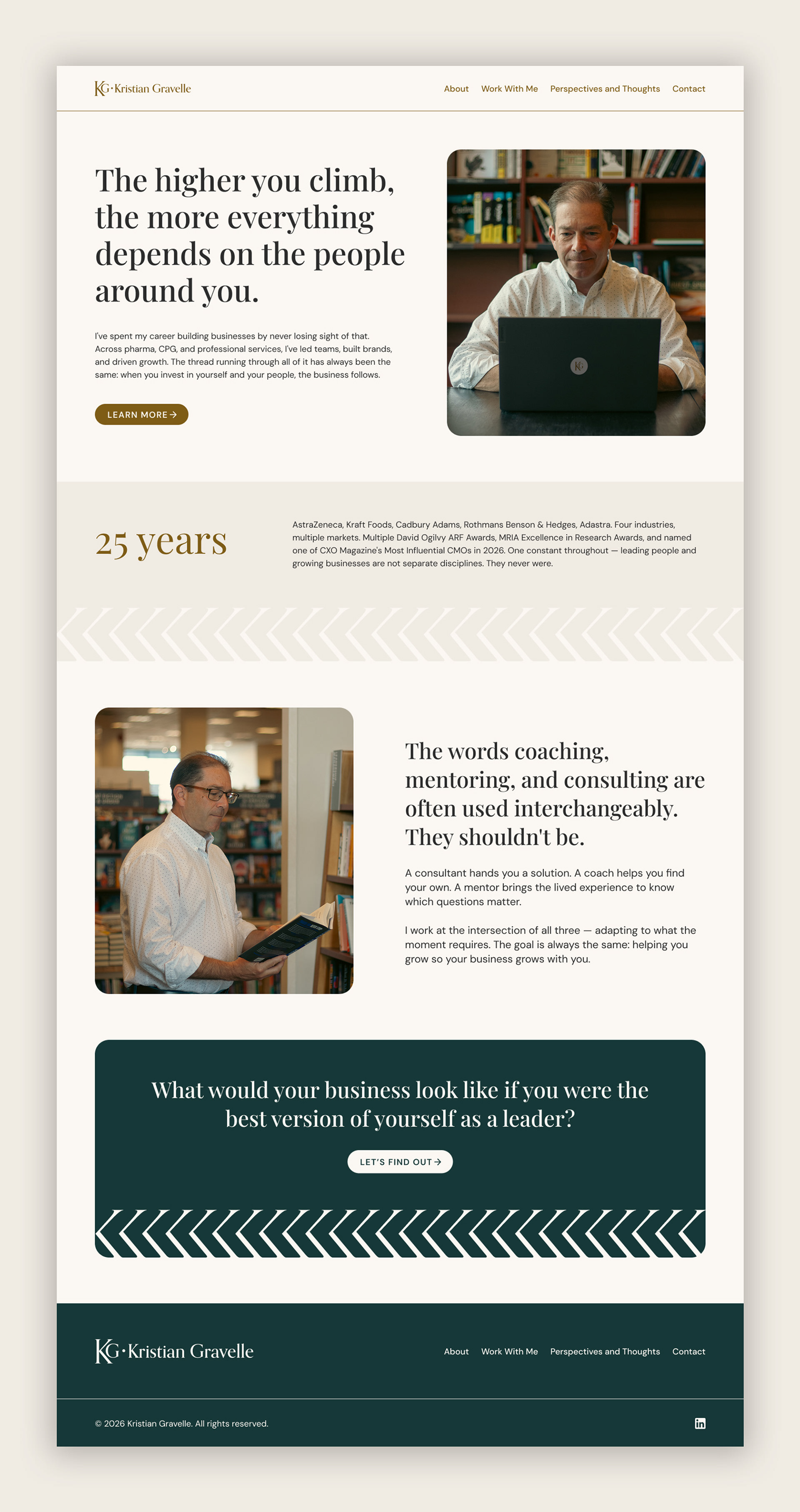
My role covered the full journey from strategy to launch: defining the brand's positioning, voice and values, creating the visual identity, documenting it in comprehensive brand guidelines, and designing and building the website that brings it all together.
The challenge
The brand had to carry the authority of 25+ years at the top while introducing a new chapter in Kristian's career. It needed to feel established and credible to senior decision-makers, yet personal and approachable enough for leaders looking for a trusted peer to help them work through their toughest challenges.
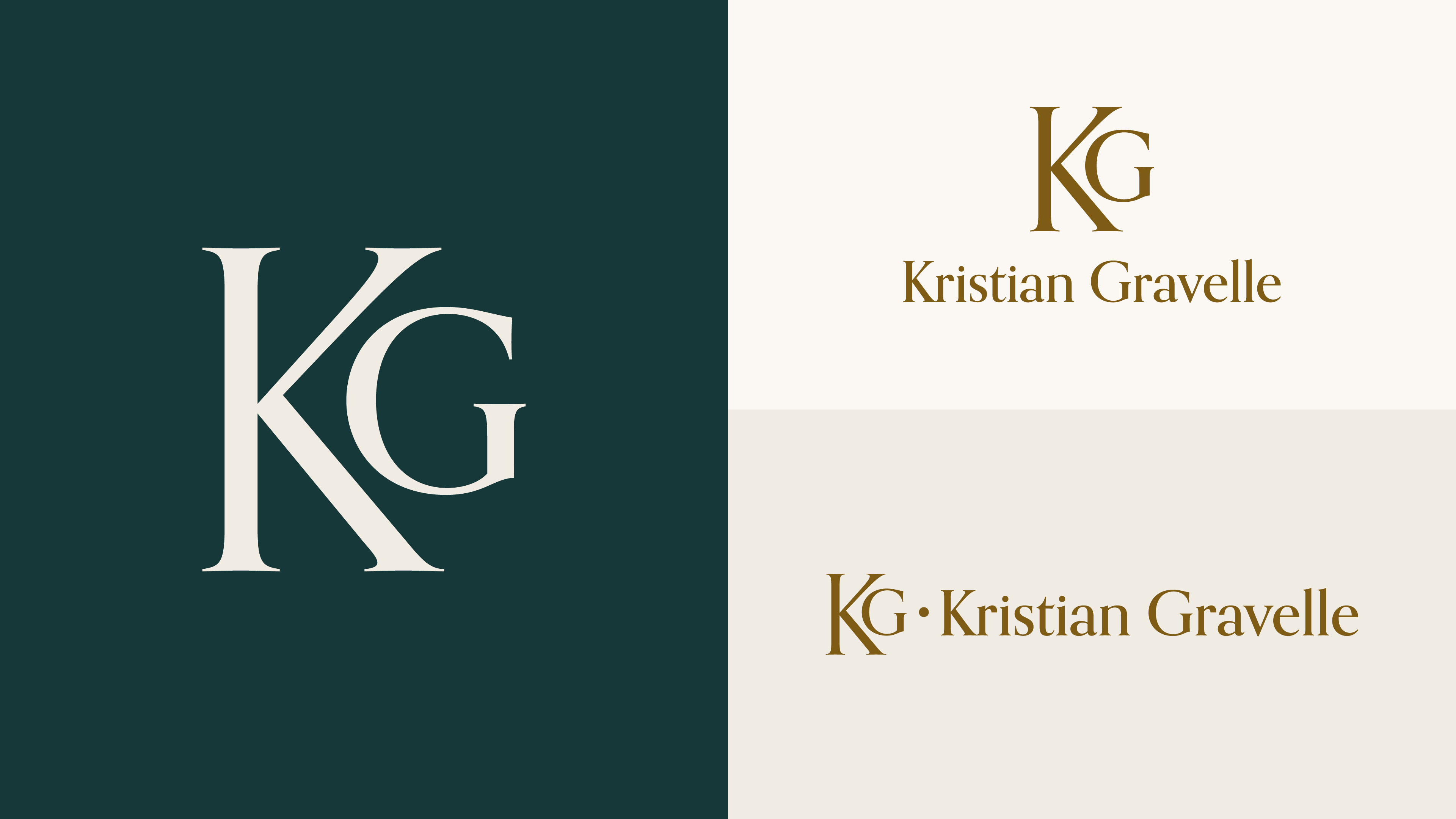
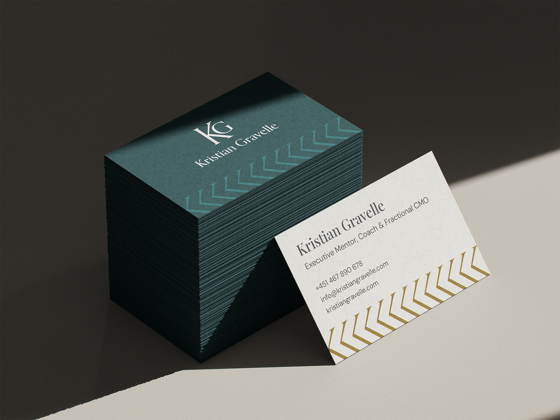
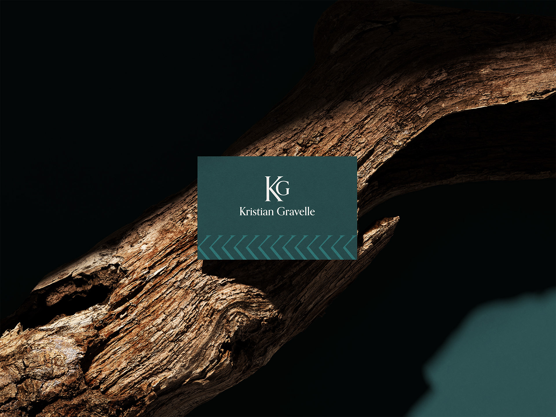
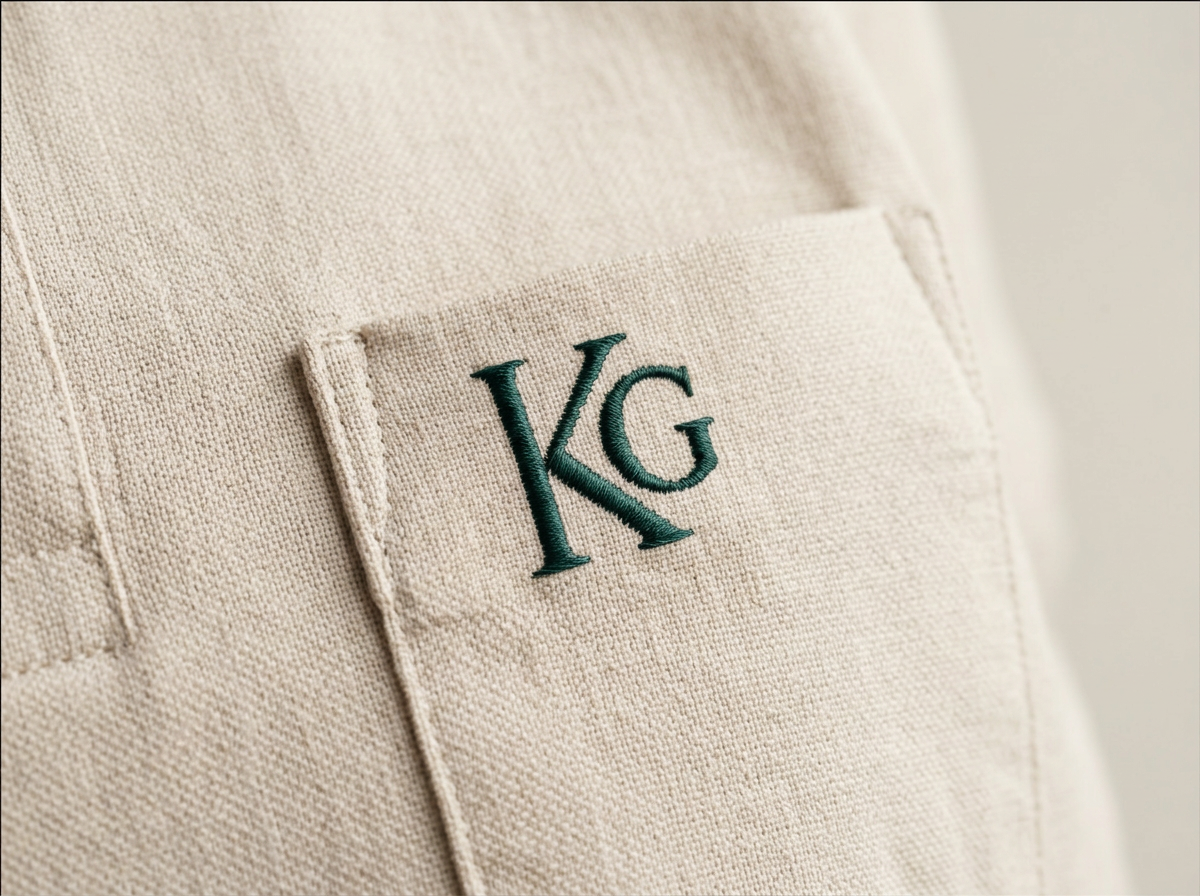
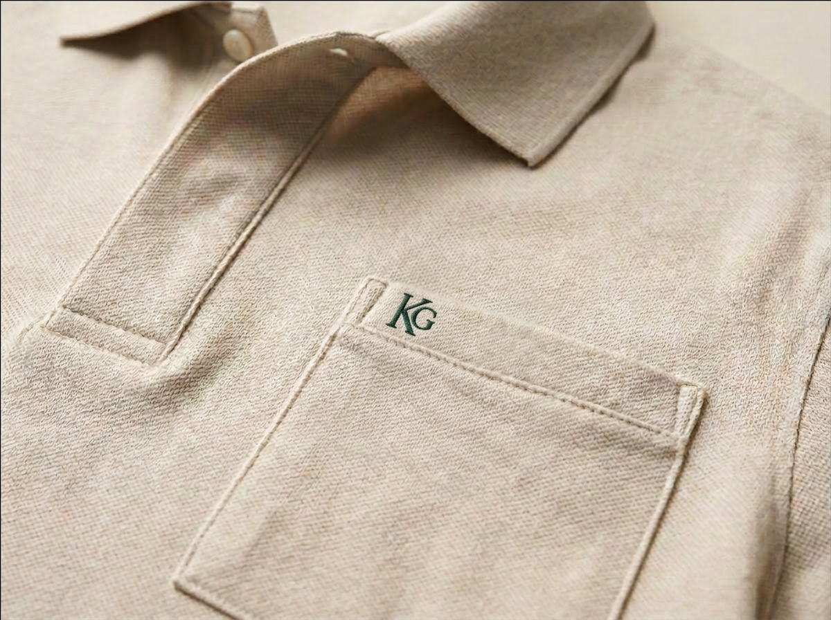
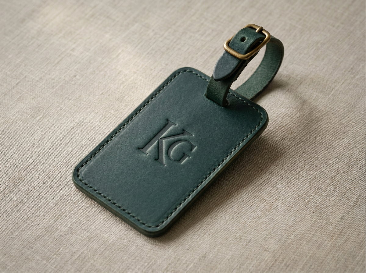
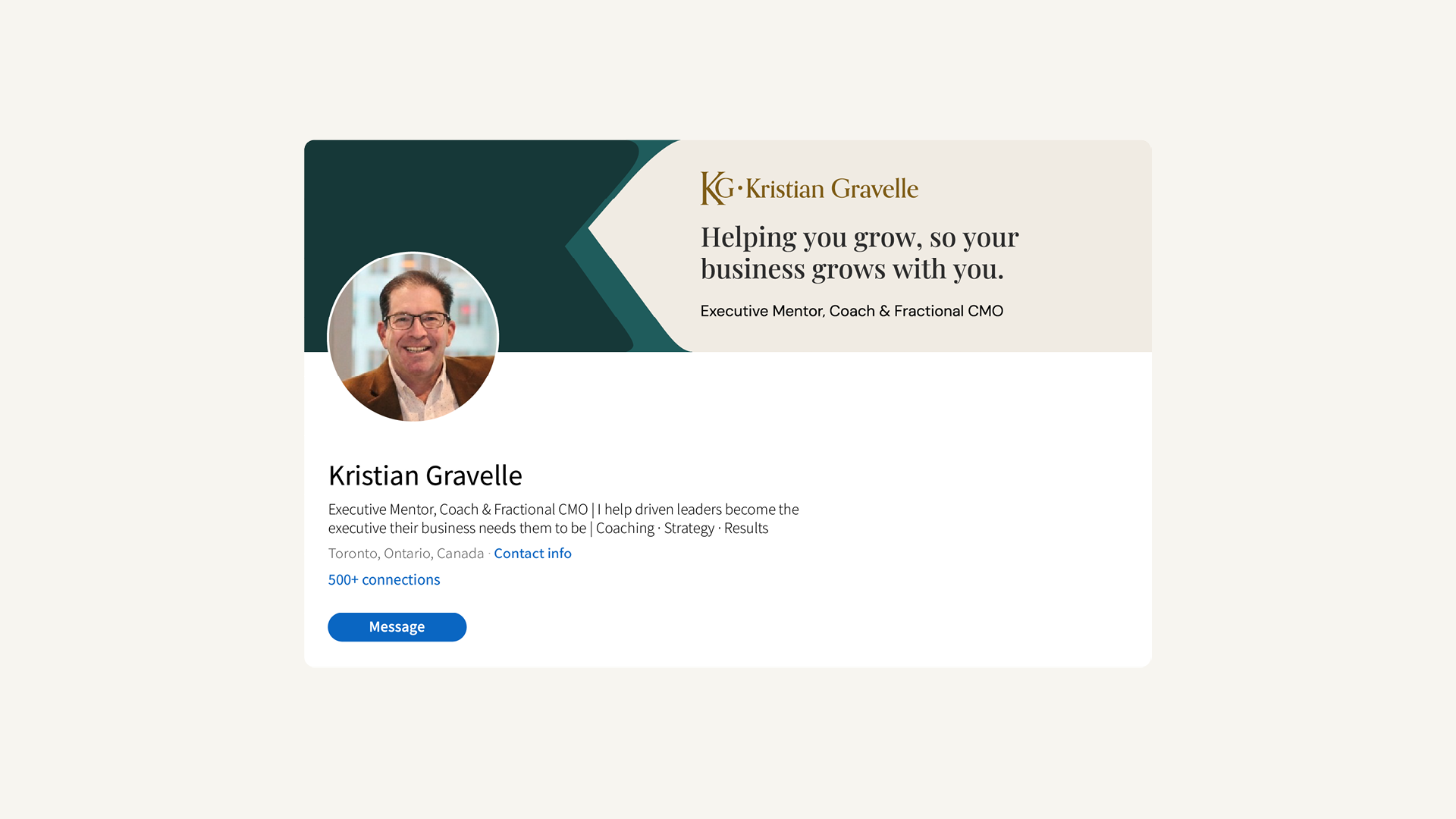
At the centre of the identity is the KG monogram. A monogram was the obvious choice for Kristian's brand, as he was already signing his emails and documents with his initials, so it felt like a natural continuation. Its composed serif letterforms balance heritage with modern restraint, reflecting a leader who is confident and knowledgeable. From there, a flexible system of primary lockups and a chevron pattern derived from the mark itself was created.
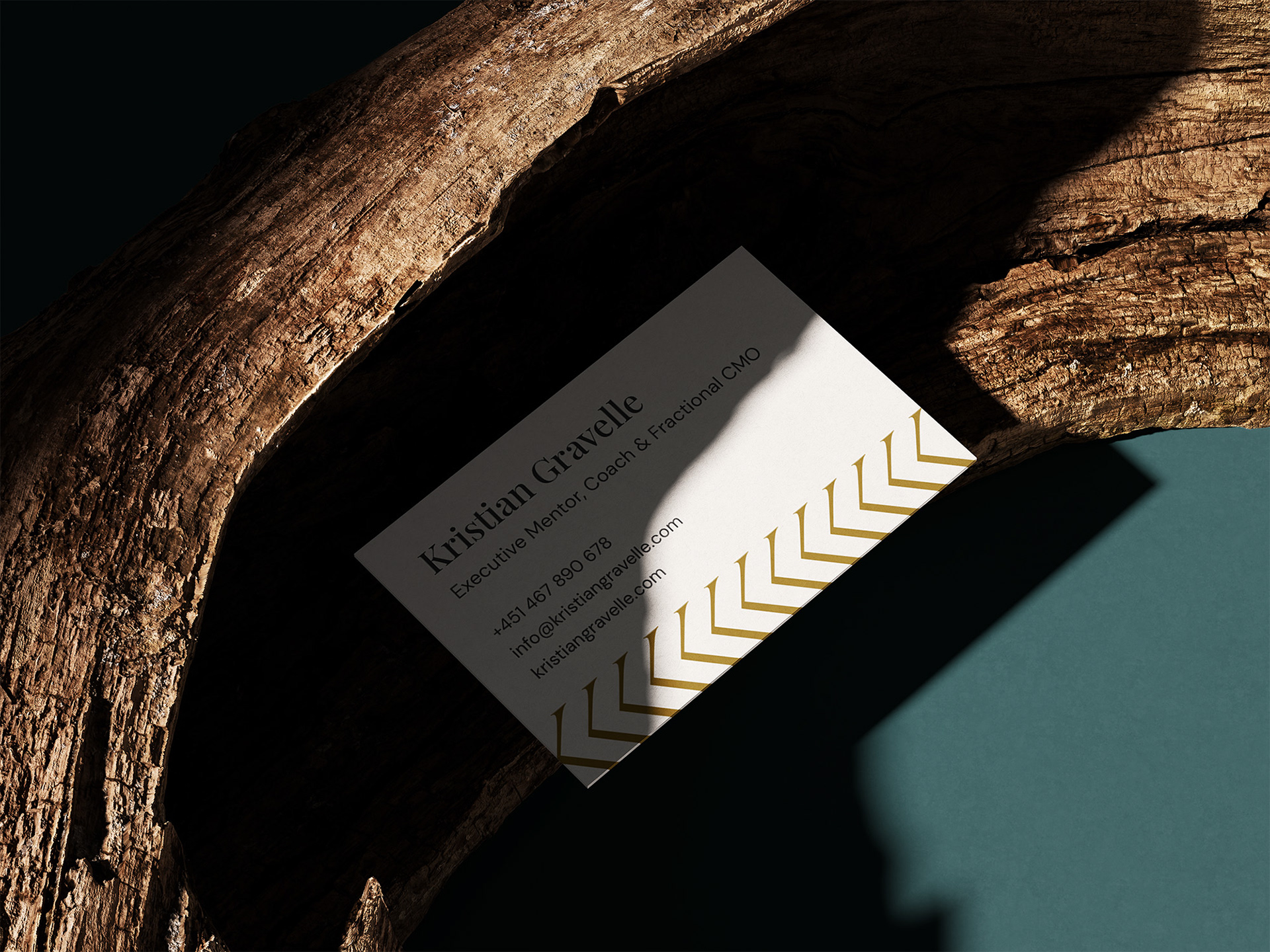
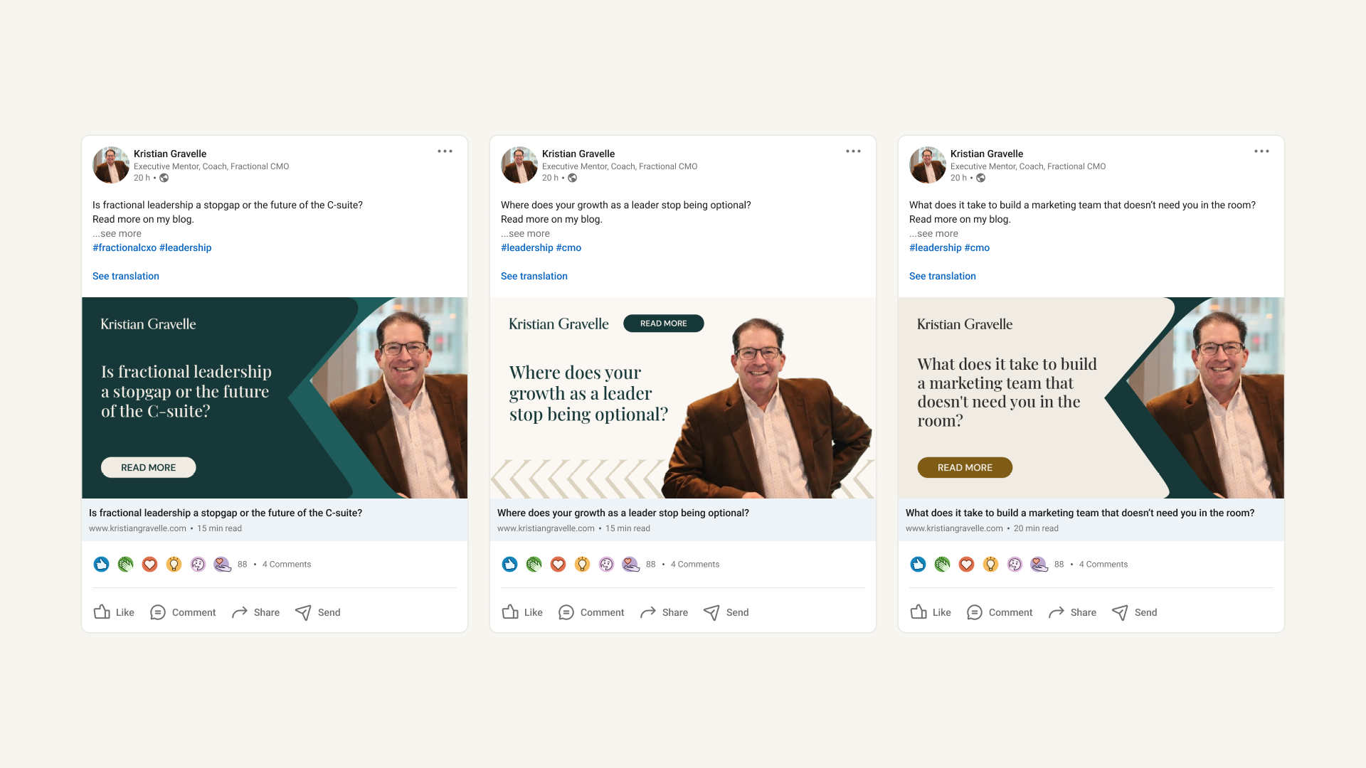
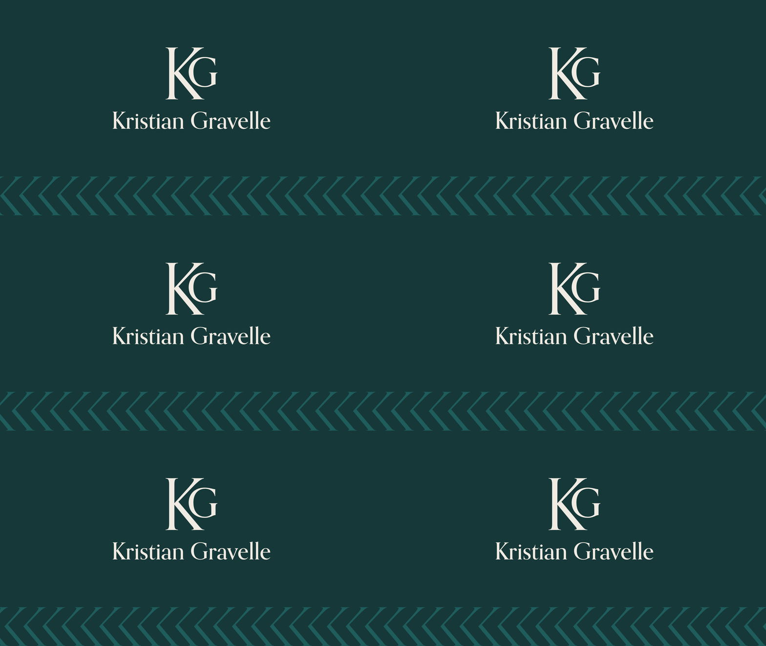
The pattern takes the arm and leg of the K and repeats them across brand surfaces, opening outward with the same forward-facing quality as the monogram. Used as a repeating row, it becomes a quiet signature beneath the content. Enlarged and aligned to the right of the page, it acts as a graphic anchor that holds the composition.
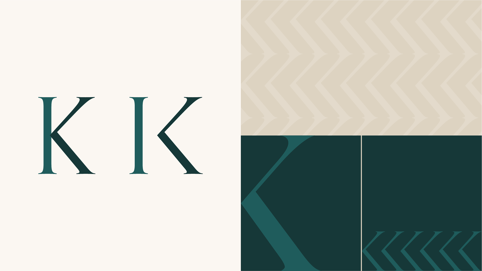
The colour palette draws from Scandinavian boreal woods and the materials at the heart of Scandinavian interior design: natural linen, warm wood and aged brass. These aren't decorative references. They're a translation of how Kristian wants to be experienced by the people he mentors, coaches and works with.
Forest Green carries depth and quiet authority, the weight of something that has taken time to grow, mirroring the 25+ years of accumulated judgement he brings to his work. Brass adds warmth and craft. It's a material associated with well-made, long-lasting things that improve with use rather than surface polish. The same quality defines the work Kristian delivers: durable, well-considered, and meant to hold value long after the engagement ends. Linen grounds the whole system in human scale, while Charcoal carries the words and gives the palette its structural weight.
Together, they set the register: assured, thoughtful, direct, human.